


Your outfit can say more than your resume before you even shake hands. The colors you wear signal confidence, professionalism, and personality, but some hues can quietly sabotage first impressions.
These eight reasons show how the wrong color choice can backfire, making interviews more stressful than they need to be.
Bright Colors That Overwhelm
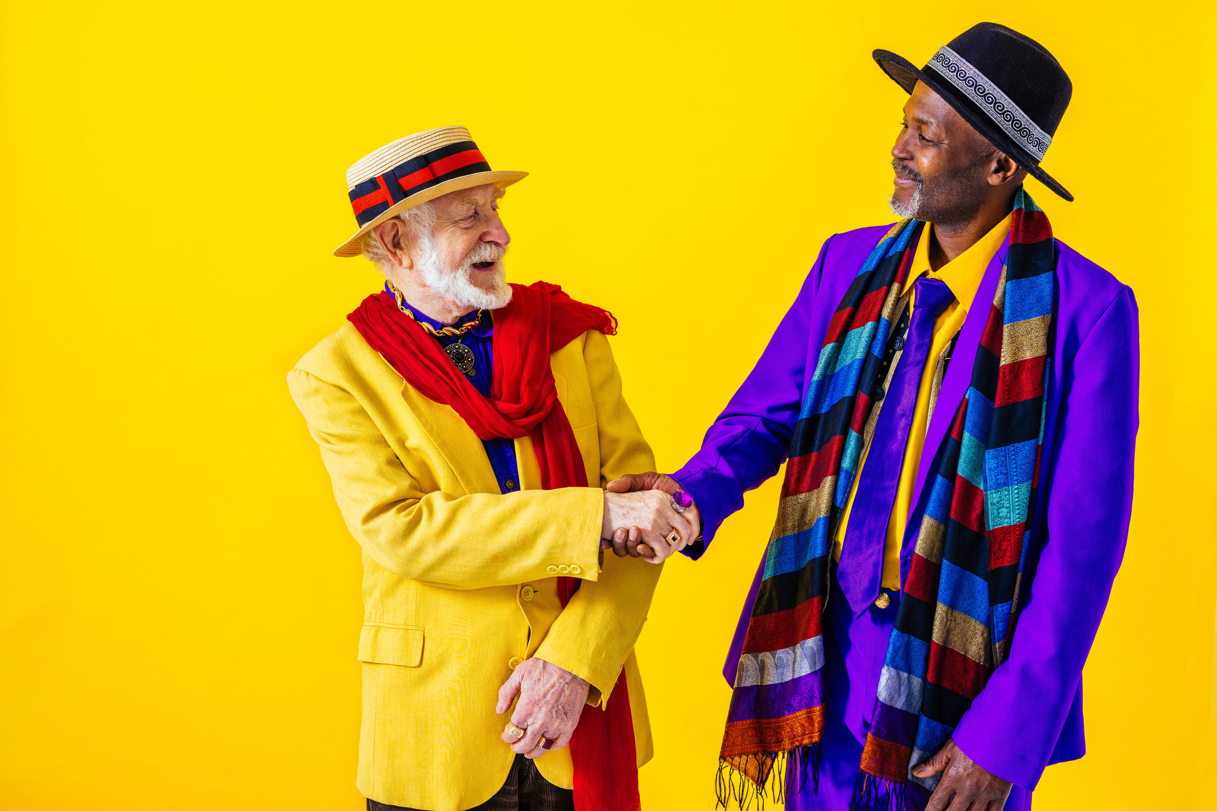
Wearing excessively bright colors can make you appear loud rather than confident. Neon shades and overly flashy tones can distract from your experience, skills, and answers during an interview. Interviewers may remember the color more than what you say.
While standing out can be good, too much visual energy can make your performance feel secondary to your outfit. Bright colors can also subtly increase stress. They may make you feel self-conscious, fidget, or shift your focus away from your responses.
Dark Colors That Seem Intimidating
Dark tones like deep black or navy can exude authority but sometimes feel intimidating. While they suggest professionalism, they can also create distance between you and the interviewer. If the goal is to connect and show approachability, too much darkness can backfire.
Candidates may appear uninviting or overly serious before the conversation begins. Moderation is key because pairing dark colors with lighter accents balances authority with warmth. This keeps your presence strong without creating emotional barriers.
Red That Feels Aggressive

Red can signal passion and energy, but also aggression and dominance. A bold red blouse, tie, or jacket may inadvertently make you seem competitive or confrontational. Interviewers may perceive enthusiasm as pushiness. Subtle shades work better, giving energy without crossing into intimidation.
Using red wisely means selecting muted tones that gently command attention. The right red can impress, but the wrong shade can overwhelm.
Pale or Washed-Out Colors That Suggest Timidity
Soft beige, pale gray, or faded pastels may make you appear hesitant. Light tones can fade into the background, making it harder for your confidence to show. In interviews, presence matters as much as words. A washed-out palette may make your answers feel less memorable and your personality less visible.
Pairing pale tones with a stronger accent can prevent the impression of timidity. Balance is crucial for appearing both approachable and assertive simultaneously.
Clashing Combinations That Distract
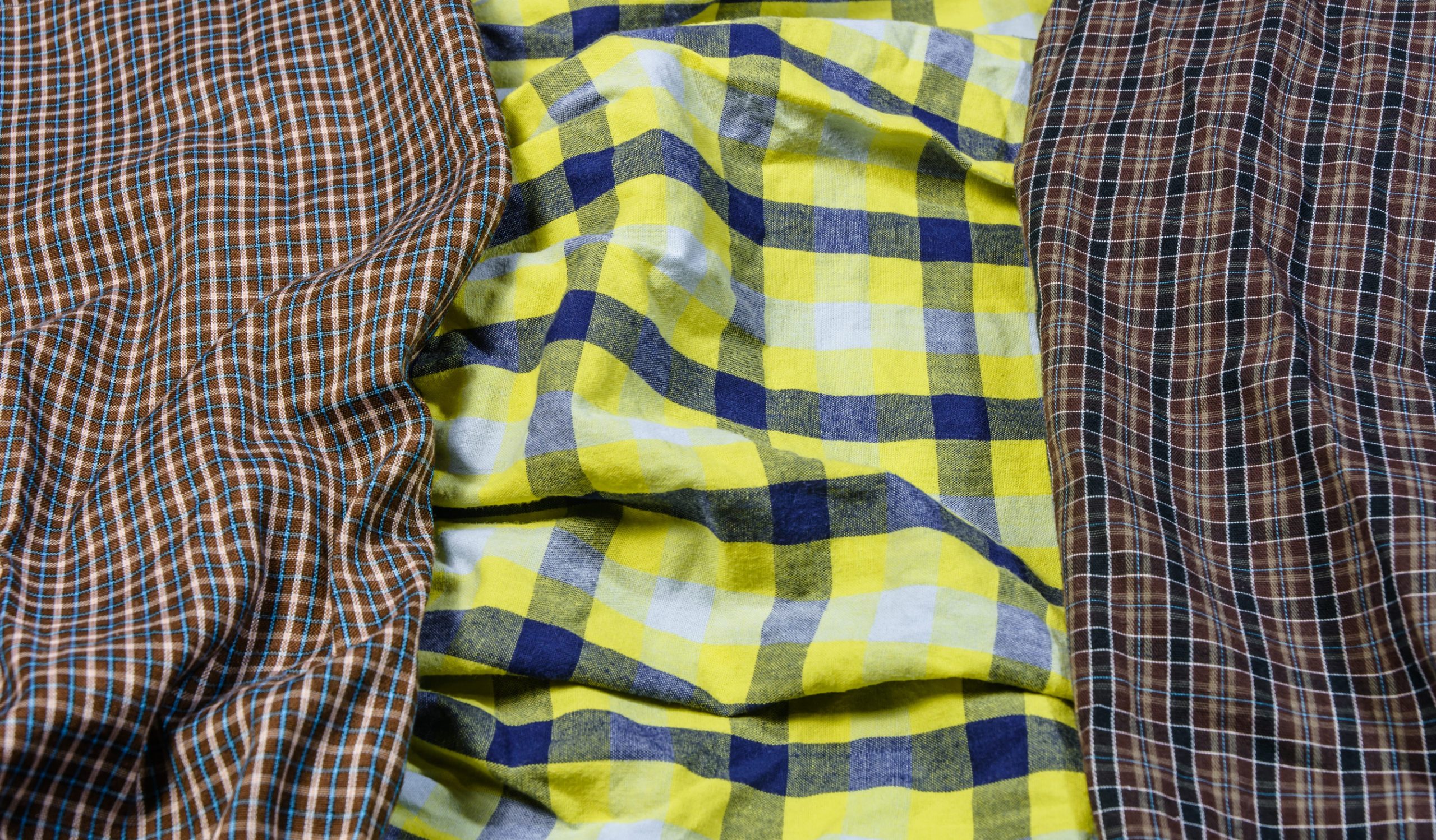
Poorly combined colors can send confusing visual signals. Patterns or hues that clash may create an impression of disorganization or lack of planning. Interviewers may focus on the outfit rather than your qualifications. Subtle harmony in color choices supports professionalism and clarity.
Coordinating your attire can subtly reinforce attention to detail. Color balance helps your skills stand out rather than your wardrobe mistakes.
Overly Trendy Colors That Date Your Look
Extremely trendy or unusual colors can distract from your capabilities. Shades popular on social media may not translate well in professional settings. Interviewers may perceive the choice as gimmicky or inconsistent with company culture.
This could make your confidence seem misplaced or inauthentic. Classic tones or balanced combinations convey reliability. They keep attention on your qualifications rather than your adherence to fashion trends.
Seasonal or Cultural Missteps

Some colors carry seasonal or cultural connotations. Wearing bright summer colors in winter or ignoring signals of company culture can create subtle dissonance. Misjudged color choices can seem careless or unprepared. Interviewers may read these mistakes as a lack of awareness.
Choosing colors thoughtfully for the occasion reinforces professionalism. Context matters as much as confidence in color selection.
High Contrast That Divides Attention
Extremely high-contrast outfits, such as black-and-white with sharp accents, can draw the eye to the outfit rather than to the speaker. While visually striking, it risks overshadowing the substance of your conversation. High contrast can make posture and gestures appear stiff or exaggerated.
The result may be an interview where your message takes a back seat to your appearance. Balancing contrast with moderate tones keeps attention where it belongs. The ideal outfit highlights your professionalism, not just the pattern.
Conclusion
Colors in job interviews do more than complement your wardrobe. They subtly communicate confidence, approachability, energy, and awareness before you even speak. The wrong choice can overshadow experience, make you appear aggressive, timid, distracting, or unaware of professional norms.
Bright or dark colors, red tones, washed-out shades, clashing combinations, overly trendy hues, seasonal missteps, and high contrast outfits all carry hidden risks that influence perception. Success is not about avoiding color entirely. It is about thoughtful selection that reinforces your presence, conveys professionalism, and supports your message.
Attention to color shows preparation, respect, and understanding of professional etiquette. When chosen wisely, your attire becomes an ally rather than a hidden obstacle in landing the position. Subtlety, balance, and context transform your interview colors from a potential hazard into a powerful statement. Smart color choices ensure you are remembered for your skills, personality, and readiness, not for a wardrobe mistake.
Read The Original Crafting Your Home


