This article was originally published on Crafting Your Home. A human contributor also wrote and edited the post.
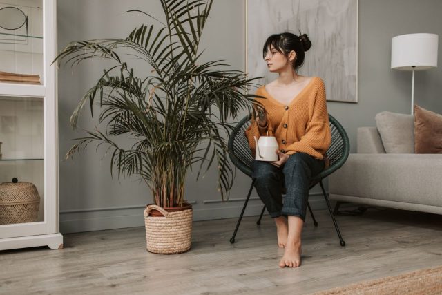
Quiet luxury is not about making a room look expensive. It is about creating a space that feels timeless, comfortable, and effortlessly refined. The right paint color can set the entire mood.
The quiet luxury design trend has become one of the biggest influences in modern interiors, moving homeowners away from flashy decorations and toward thoughtful, understated elegance.
Instead of bold statements and fast-changing trends, quiet luxury focuses on quality, simplicity, and calm.
Think warm neutrals, soft earth tones, natural textures, and colors that look beautiful today and still feel sophisticated years from now.
Interior designers often describe the style as creating a home that feels collected rather than decorated. The goal is not to impress visitors with expensive-looking details but to create an environment that feels welcoming and personal.
Paint plays a major role in achieving that look.
The right shade can make walls feel warmer, furniture looks richer, and an entire room feel more intentional.
Warm Neutrals That Create an Elegant Foundation
Soft beige for timeless warmth
Beige has returned as a favorite among designers because modern versions feel far more sophisticated than the yellow-toned shades popular decades ago.
A soft beige creates a calm backdrop that works well with wood, stone, linen, leather, and other natural materials.
Unlike cooler neutrals, warm beige adds a sense of comfort while still maintaining a polished appearance.
Designers often use beige in living rooms, bedrooms, and open spaces because it allows architectural details and furniture to stand out without competing for attention.
The secret is choosing a balanced beige with subtle undertones rather than a shade that feels too yellow.
Greige for modern sophistication
Greige, a blend of gray and beige, has become a popular choice for homeowners who want something neutral but not boring.
The color works especially well in quiet luxury interiors because it provides flexibility.
It pairs beautifully with natural wood, creamy fabrics, brass accents, and stone surfaces.
Greige can make a room feel elegant without appearing cold.
Many designers prefer this shade because it adapts to different lighting conditions and works across multiple design styles.
It creates a background that lets furniture and textures become the focus.
Warm white for a soft, refined look
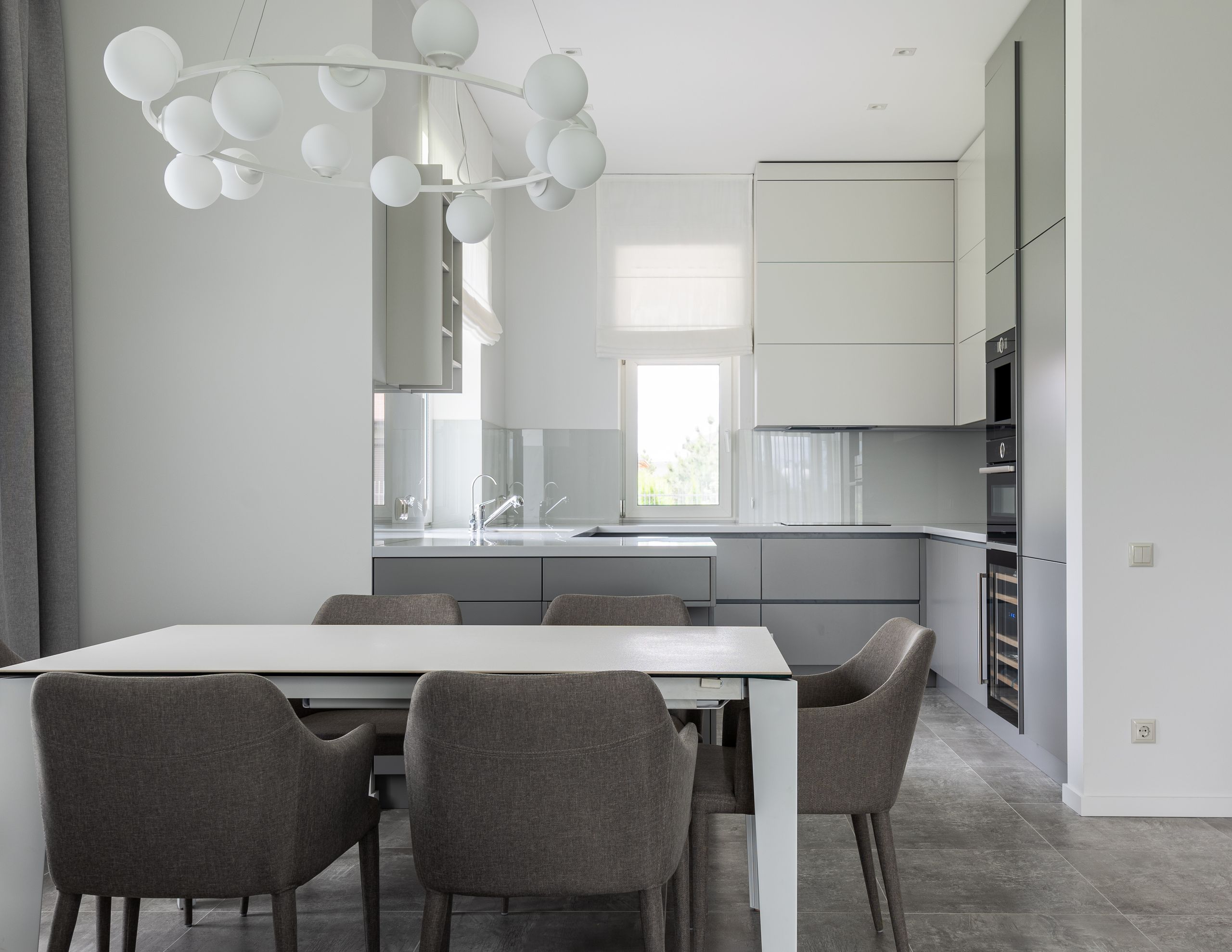
White remains one of the most classic paint choices, but quiet luxury interiors often avoid harsh, bright whites.
Instead, designers lean toward warmer whites with subtle cream or beige undertones.
These shades create brightness while maintaining a cozy atmosphere.
A warm white can make a home feel larger and more open without creating a sterile feeling.
It works especially well in spaces with natural light, textured fabrics, and traditional architectural details.
Earth-Inspired Colors That Add Depth and Character
Soft olive green for a natural feel
Olive green has become a popular choice for homeowners looking to bring a connection to nature indoors.
The color feels sophisticated because it is calming without being plain.
In quiet luxury spaces, olive green works beautifully with wood furniture, natural stone, antique finishes, and neutral fabrics.
Unlike brighter greens, softer olive tones create a sense of balance and relaxation.
Designers often use it in offices, dining rooms, and bedrooms where a more intimate atmosphere is desired.
Taupe for understated elegance
Taupe is one of the most reliable colors for creating a luxurious but comfortable space.
It sits between gray and brown, offering warmth while maintaining a refined appearance.
The beauty of taupe is its ability to complement almost any material.
It works with marble countertops, oak floors, velvet furniture, and woven textiles.
For homeowners who want a sophisticated neutral that feels richer than basic gray, taupe offers a timeless option.
Deep charcoal for dramatic sophistication
Quiet luxury does not always mean light colors.
Dark shades can create incredible elegance when used correctly.
A soft charcoal gray can add depth and create a dramatic atmosphere without feeling overwhelming.
Designers often use charcoal in dining rooms, libraries, bedrooms, or accent walls.
When paired with warm lighting and natural materials, the color can create a high-end feeling similar to luxury hotels and historic homes.
How to Choose Paint Colors for a Quiet Luxury Home
Creating a quiet luxury look is not only about selecting the right color. It is about creating harmony throughout the home.
Designers often recommend considering:
- Natural lighting in each room
- Existing flooring and furniture
- The mood you want to create
- How colors connect between spaces
Quiet luxury interiors usually avoid using too many competing colors.
Instead, they rely on a carefully selected palette that flows naturally from room to room.
A living room might use warm beige walls, a hallway might transition into soft white, and a bedroom might introduce a calming olive or taupe.
The result feels intentional rather than random.
Another important element is texture.
Paint colors become more luxurious when paired with materials such as wood, linen, wool, stone, and leather.
A simple wall color can feel completely different when surrounded by high-quality textures.
Why Quiet Luxury Colors Continue to Stay Popular
The appeal of quiet luxury comes from its focus on longevity.
Unlike trendy colors that quickly become outdated, these shades are designed to age gracefully.
They create homes that feel comfortable, personal, and sophisticated without relying on excessive decoration.
The best paint colors for a quiet luxury look are not the ones that demand attention.
They are the ones that quietly make everything around them look better.
A beautifully chosen neutral wall, a soft earthy tone, or a carefully selected dark shade can transform a home into a space that feels timeless.
Luxury does not always announce itself.
Sometimes, it simply feels right.
If you like what you just read, then subscribe to our newsletter and follow us on social media.